


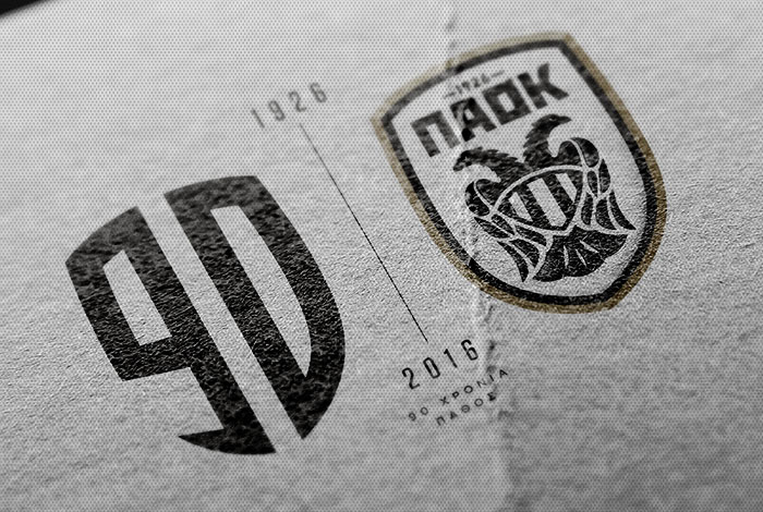
90 years of passion – The logo
Two years after giving us PAOK’s new logo, designing company Beetroot are back in order to create the new special logo for the “Double-Headed Eagle’s” 90-year anniversary.
Design is an area as demanding as football. There are no tough duels, injuries and sweat, but requires the creativity, sharp mind, strategy and concept that the popular game also demands.
In order to create something new, one needs more than a basic knowledge of design. They must decipher the peculiarities of the object and adjust any novelties on values and principles that are non-negotiable. Easier said than done…
For that reason, PAOK FC entrusted Beetroot again for the creation of their 90th anniversary logo. They are one of Greece’s top graphic design and illustration studios and are based in Thessaloniki. They are the ones who created PAOK’s new logo.
The anniversary logo can function as a separate logo. It symbolizes PAOK’s passion from the first day of their foundation until today. That explains the inscription “90 years of passion”.
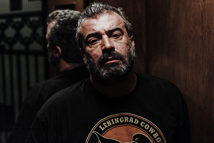
“This logo reflects the past with the characteristic black and white stripes of the shirt, but the present as well, with the outline of the club’s new logo”, Beetroot Creative Director Giannis Charalambopoulos said. “This logo is a symbol that doesn’t just communicate the anniversary, but its dynamic form celebrates the upcoming 90 years as well, as it is designed to service the needs of a modern football club”.
The special logo of the 90th anniversary features in PAOK’s special kits that the players wear to mark this significant year. It will be visible in all celebratory events of PAOK and will also be stamped in products that will be sold at PAOK FC Official Stores.